Branding project - Walker Wellness
The brief: A brand for a yoga & wellbeing practice that aims to inspire people to live a healthy lifestyle through yoga practice & good nutrition. Due to the nature of the practice, the logo needed to represent yoga, nature and growth.
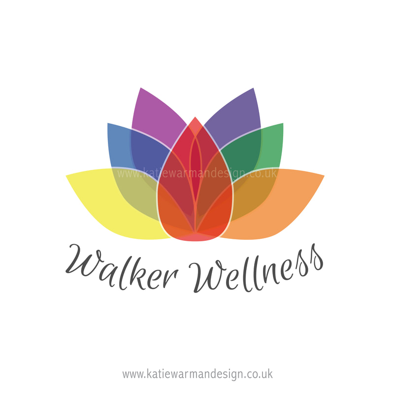
The outcome: The final logo utilises the shape of a lotus flower which represents the theme of nature and growth as requested in the brief. The flower is growing upwards and expanding outwards which could represent the personal growth involved for the individuals taking part in the practice. In addition, the lotus flower is a very apt shape for yoga as they grow from the bottom of streams and muddy ponds to rise above the water and bloom. Therefore it symbolically represents being fully grounded in earth, yet aspiring towards the divine.
As well as this, an important aspect of yoga are the chakras, which are the seven energy centres in our body. Therefore, it was important this logo included the seven colours that are associated with each chakra. The logo also utilises a font that appears informal and relaxed to represent the type of practice Walker Wellness is and how people feel during the sessions.
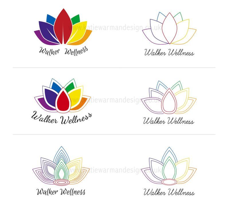
Below is the final logo, alongside a variety of work in progress versions that were created during the design process. There is also an example of the corporate stationery.


