
Red Hawk Security Solutions
Brief:
This security solutions company required a company logo and business card design.
Outcome:
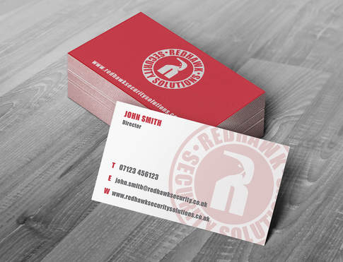
Due to the nature of the business being focused on video surveillance and the company name containing 'Red Hawk', it was important for me to utilise the eye of a hawk in the logo, with the eye illustrating 'surveillance'. The company name also impacted the colour scheme, as it was key to include red. As well as this, a heavy-weight typeface was chosen to illustrate the significance and impact the services and the products have in commercial and residential sectors.
This security solutions company required a company logo and business card design.
Outcome:
Due to the nature of the business being focused on video surveillance and the company name containing 'Red Hawk', it was important for me to utilise the eye of a hawk in the logo, with the eye illustrating 'surveillance'. The company name also impacted the colour scheme, as it was key to include red. As well as this, a heavy-weight typeface was chosen to illustrate the significance and impact the services and the products have in commercial and residential sectors.