Flight Safety Instructions
Brief:
To redesign existing flight safety cards to be suitable for a universal audience without the requirement of translations.
Outcome:
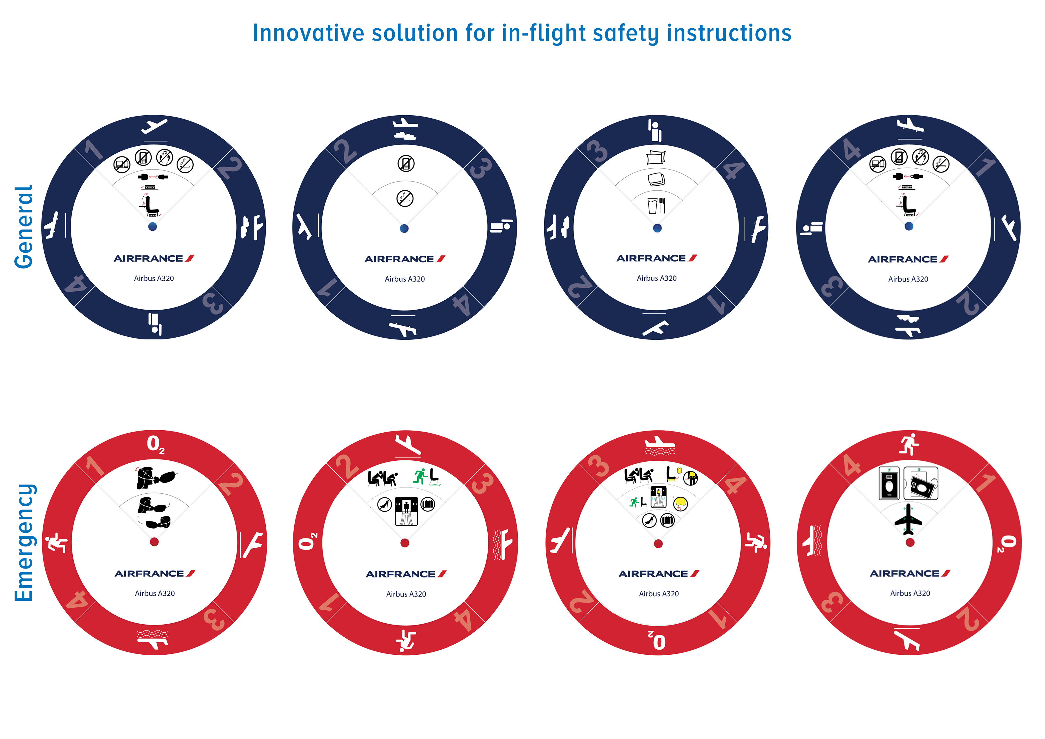
An innovative solution to ensure flight safety instructions were easy to understand by all passengers. The two flight safety cards, one for emergency instructions (red) and one for general information (blue), focuses on visual communication via pictograms rather than words. This was to transcend language barriers without the requirement of translations. To ensure the flight safety cards did not appear too complex, like existing versions, the final design incorporated a top layer, which could be spun to reveal the next section of the instructions to the passenger when they are ready.
The flight safety instructions are an important document and can potentially save lives, therefore it was essential the document was easily understood and not ignored.
To redesign existing flight safety cards to be suitable for a universal audience without the requirement of translations.
Outcome:
An innovative solution to ensure flight safety instructions were easy to understand by all passengers. The two flight safety cards, one for emergency instructions (red) and one for general information (blue), focuses on visual communication via pictograms rather than words. This was to transcend language barriers without the requirement of translations. To ensure the flight safety cards did not appear too complex, like existing versions, the final design incorporated a top layer, which could be spun to reveal the next section of the instructions to the passenger when they are ready.
The flight safety instructions are an important document and can potentially save lives, therefore it was essential the document was easily understood and not ignored.